
The definition of accessibility is “the quality of being easily understood, used and appreciated”. Therefore, when we design something to be accessible, from the construction of a building to a digital product, our goal is that all people, independently of any disability, could easily use the product without missing on the experience.
The Importance of Accessible Digital Design
According to the CDC (Centers of Disease Control and Prevention), 61 million adults—approximately 26% of the adult population—in the United States live with a disability. To create an inaccessible product today is to prevent or make it difficult for people with disabilities or limitations, whether permanent or temporary, to use it. Furthermore, it violates their right to equality and social inclusion, provided by law in many countries.
Digital accessibility is about design for all, it’s about the user experience and usability. If a person with a hearing impairment, an elderly individual inexperienced with technology, and a person with dyslexia can use your product, then all other users benefit too.
After all, a website where you can activate the subtitles of a video, which has simple language and intuitive navigation with large touch areas—making it possible to use without difficulties while in public transport undoubtedly contributes to everyone’s positive experience.
We as designers, developers, managers, and people involved in the technology area, must build the best possible product for our users, opening the doors to digital inclusion and putting people first. And to help us in this task we can count on Web Content Accessibility Guidelines (WCAG).

Braille handrail describing the landscape in the background for visually impaired visitors in Naples, Italy. (Picture by Castel Sant’Elmo. “Follow the Shape” by Paolo Puddu.)
What is WCAG?
The Web Content Accessibility Guideline or WCAG is the set of recommendations for the development of accessible digital products. Its latest version, WCAG 2.1, is organized around principles, guides, success criteria, and compliance levels.
- Principles: There are 4 fundamental principles that organize the accessibility criteria into categories, they are: Perceivable, Operable, Understandable, and Robust.
- Guides: There are 13 guides responsible for sub-organizing the accessibility criteria into different objectives, each one aligned with a goal that we must achieve to make our product more accessible, considering different types of disability.
- Success criteria: Distributed among the guides are 78 success criteria. Each of the success criteria has compliance tests and requirements that must be met for our digital product to be accessible.
- Compliance Levels: There are 3 different compliance levels that categorize success criteria by their complexity.
- Level A – It is the minimum that a product must have to be considered accessible, it has 30 basic criteria and all of them must be met to reach this level.
- Level AA – This is what is expected of a product to deliver a good experience and usability for its users, for many companies and government websites this level is what we should aim for, it has 20 criteria of its own and we must also meet all level A criteria.
- Level AAA – This is the most complex level of accessibility, not all of its criteria can be implemented for all types of products, so it is not recommended that this level of compliance be a mandatory requirement in all cases. It has 28 criteria of its own and must also satisfy all AA and A level criteria.
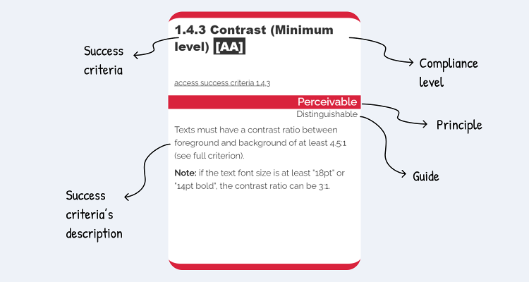
Example of one of the WCAG guide cards and how to identify its characteristics. Image from WCAG Guide, created by Marcelo Sales.
The Principles and Criteria of Digital Accessibility
For our product to be considered accessible, we must meet all success criteria for at least one of the compliance levels (A, AA, or AAA). These criteria are organized into four accessibility principles, which represent the fundamentals we must follow to achieve digital inclusion. They are:Perceivable
It means that the user must be able to perceive your product and all the information contained in it. Essentially, all content must be visible and audible so that it is understood without any loss of information.Providing textual alternatives to images, offering features such as translation in sign language or real-time audio description, maintaining an easy-to-digest interface, with well-structured information, easy to be seen and heard, are some of the actions we must take so that our product is perceivable for all.
Example:
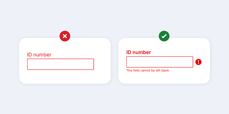
- Success criteria: Use of Color (criteria 1.4.1 – level A)
- Definition: Color should not be the only way used to display information or discern visual elements.
- Intuition: Ensure that all users have access to information that is transmitted using colors, where each color has a meaning attached to it.
- Benefits: Mrs. Anna, a retired elderly woman who cannot differentiate between colors very well.
- Problem: Required field indicated only by using red color.
- “I couldn’t complete my registration because I got stuck on this screen, so I asked my grandson for help and he said he needed to fill in my ID number. I couldn’t differentiate because I don’t see red very well.”
- Solution: Required field indicated by the use of text, icon, and red color.
- “It’s easier for me when I can read and understand the problem, without relying on colors.”
Operable
It means that your product’s interface and navigation can be operated by any type of user, with or without the use of assistive technologies. Your product needs to be usable and functional, with expected behaviors, for example, a registration (sign up) will be created when completing a form and selecting the “create account” button. In addition, the user must always be in control of how they use the product.Using a website and its features only by keyboard navigation, being able to turn off distracting animations, increasing the automatic display time of each slide for smoother reading, clearly know the purpose of a link and where it will redirect you, and selecting a form field without difficulties as it has a large clickable area, are some of the actions that make the product more operable for everyone.
Example:
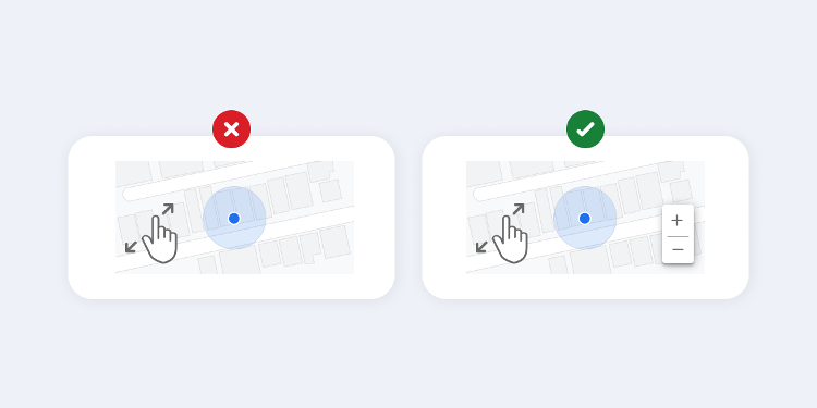
- Success criteria: Pointer Gestures (criteria 2.5.1 – level A)
- Definition: Any functionality that requires a tactile path to be activated also needs an alternative method that facilitates interaction for those who cannot perform the gesture.
- Intuition: Ensure that content can be controlled by a variety of devices and assistive technologies.
- Benefits: George, autonomous with limited finger movements due to cerebral palsy.
- Problem: Application only allows zooming by pinch gesture.
- “I wanted to see this street closer to look for a reference, but I can’t do this movement with my fingers, I need to zoom in another way.”
- Solution: Zoom is also applied by the “plus” and “minus” buttons.
- “I’m glad there are these buttons to zoom in and out.”
Understandable
It means that the user must understand all the information, as well as the functioning of an interface, without any content that goes beyond their understanding.Having an understandable product is helping users to avoid and correct errors when filling out a form, maintaining predictable behavior of features, with consistency and that can be related to the real world, with a simple, easy-to-understand language.
Example:
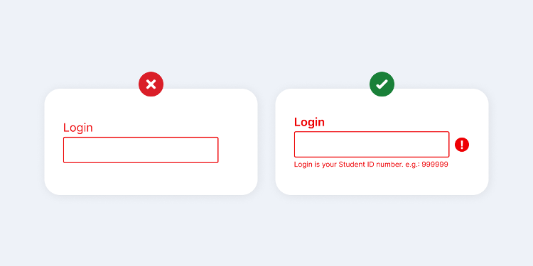
- Success Criteria: Error Suggestion (criteria 3.3.3 – level AA)
- Definition: If an error is detected, then suggestions on how to correct it should be provided to the user unless this would jeopardize the security or purpose of the content.
- Intuition: To ensure that all users are provided with appropriate tips on how to fix and recover from an error, should it occur.
- Benefits: Leo, a student with dyslexia and a learning disability.
- Problem: There are no suggestions for fixing errors in forms.
- “I was trying to access the student portal to see my grades, but it just showed that my login was wrong, so I gave up and had to call the school office.”
- Solution: There are suggestions for correcting errors in forms.
- “It’s much easier for me when the system shows suggestions on how to fill in a form field correctly”
Robust
It means that the content must be robust enough to be reliably interpreted by multiple technologies, and even with their evolutions, the content must remain accessible.
It is important that your product is prepared to be used through various assistive technologies, so you should think about the greatest possible compatibility between current technologies on the market and keep up-to-date for the solutions to come.
Example:
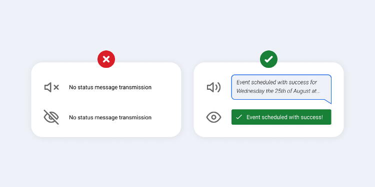
- Success criteria: Status Messages (criteria 4.1.3 – level AA)
- Definition: Any type of message that is the result of an action or that informs the progress of a process, and that is relevant to the person, must be transmitted without a change of context on the screen.
- Intuition: Ensure that all users are alerted to major changes in unfocused content, and do so in a way that doesn’t unnecessarily interrupt them.
- Benefits: Liz, a blind university professor who uses a screen reader.
- Problem: There is no audible feedback on the outcome of an action.
- “I booked a time in the auditorium for my presentation tomorrow, but I was unsure whether the time was also booked on my calendar, as I asked.”
- Solution: There is audible feedback about the result of an action.
- “Whenever I add a new event to my calendar there is a sound confirmation”
Conclusion
When we create and develop a product with these principles in mind, we are creating a good experience for all our users, we are opening the door for more people to be able to use our service.
We must remember that designing for accessibility is not generosity, but a right of people with disabilities.
Let’s together make the world a more inclusive place!
Want to know more about accessibility?
Follow these links to content relevant to the subject:
WCAG Guide – A quick reference guide to all accessibility success criteria, explained simply by the “Everyone for Accessibility” project, created by Marcelo Sales. The success criteria used here were based on this guide.
Inclusive design principles – Discover the principles of inclusive digital design.
“Do’s” and “Don’ts” when designing for Accessibility – Quick and cool tips on do’s and don’ts when designing for accessibility.
Web Content Accessibility Guidelines (WCAG) 2.1 – Check in full all WCAG recommendations on accessibility.
References:
- https://katholmesdesign.com/inclusive-toolkit
- https://w3c.github.io/wcag/understanding/intro
- https://www.w3.org/TR/WCAG21/#intro
- https://www.w3.org/WAI/WCAG21/Understanding/intro#understanding-the-four-principles-of-accessibility
- https://www.w3.org/WAI/standards-guidelines/wcag/new-in-21/
- https://guia-wcag.com/en/
- https://techcrunch.com/2020/07/27/as-ada-turns-30-tech-is-just-getting-started-helping-people-with-disabilities/
- https://www.cdc.gov/media/releases/2018/p0816-disability.html
- https://beta.ada.gov/
- https://www.cdc.gov/ncbddd/disabilityandhealth/infographic-disability-impacts-all.html#:~:text=61%20million%20adults%20in%20the,have%20some%20type%20of%20disability.
Acknowledgement
This piece was written by Michelly Marsoleta, UX Designer at Encora. Thanks to Isabela Penteado, Debora Soares, Flávia Negrão, João Caleffi and Kathleen Mccabe for reviews and insights.
People photo created by DCStudio – www.freepik.com
About Encora
Fast-growing tech companies partner with Encora to outsource product development and drive growth. We offer dedicated teams, team augmentation, and individual projects to our clients and are continually looking for the best methodologies to give you the best results. Curious to learn more about UI/UX trends and how to implement them into your projects? Contact us to learn more about our software engineering capabilities.
